2025 - 2026 · 1 year
From concept to app: brand, design system and MVP for a new way to meet people
Location-based social dating app
The challenge
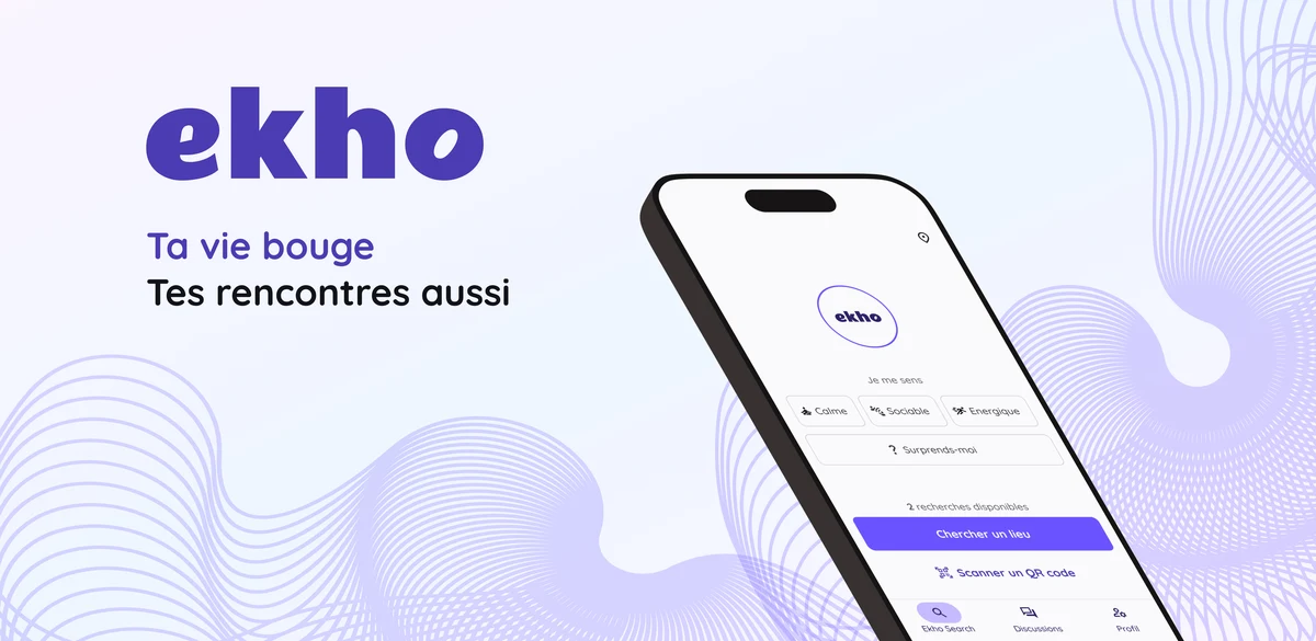
Ekho rethinks dating: instead of swiping through profiles, the app suggests a venue matched to your current mood — and connections happen in person, between people sharing the same mindset at the same place at the same moment.
Starting from scratch on a brand-new concept, with a team of 3 developers and 1 business lead. Everything needed to be created: brand identity, user flows, MVP logic. And for such an unfamiliar concept to work, the experience had to be immediate — the right venue, in seconds, matched to the moment.
My mission: own the entire product design dimension — from brand identity and design system, to flow diagrams and MVP roadmap, through to high-fidelity UI and product QA.
Methodology
Building the identity
A brand to create from nothing
First priority: give Ekho a distinct visual personality — modern, warm and immediate, suited to a mass-market mobile product. I defined the visual guidelines (colors, typography, iconography, tone) and built the mobile design system on top, so that every screen that followed would stay consistent regardless of delivery pace.
Structuring the MVP
Roadmap, flows and tickets: framing the MVP with the team
Together with the business lead, we prioritized MVP features: which moods, how to match venues to users, what the connection flow would look like, and in what order to ship. I translated these decisions into user flow diagrams and dev tickets the engineering team could work from directly. Team meetings had a structured agenda — to move forward, not clarify the same questions on a loop.
Designing the flows
Three flows to make self-evident for an unfamiliar concept
Choose your mood and get the right venue in seconds. Understand why that venue matches your moment. Discover someone there and start a conversation. Three flows users had to grasp without any learning curve — for a concept no one had seen before. The challenge: make every interaction feel natural from the very first open.
Supporting delivery
Product QA: checking the concept holds up in real states
I followed each delivery with the dev team: checking conformance to designs, flagging gaps, giving feedback on edge cases and empty states. QA was also the opportunity to verify the experience stayed readable in real conditions — not just in ideal mockups.
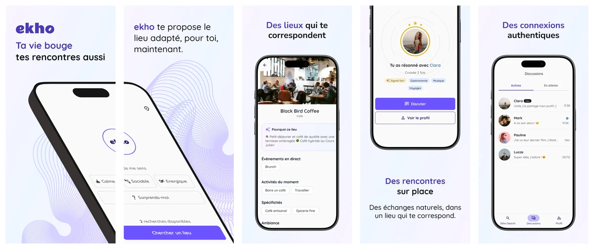
Ekho, available on the App Store and Google Play Store.
Results
- Brand identity built from scratch (visual guidelines, mobile design system)
- MVP specified and shipped: roadmap, flow diagrams, dev tickets, team meetings
- High-fidelity UI for the 3 core flows (mood → venue, matching, messaging)
- Product QA: conformance checks and dev feedback throughout delivery