2023-2025 · ~2 years
Unblocking a solar B2B team with research and a scalable system
SaaS & IoT B2B solar platforms
The challenge
Dualsun was going through a period of hypergrowth (revenue went from roughly €30M to €70M in 2023), putting heavy pressure on delivery speed. As the sole designer across SaaS & IoT B2B solar platforms, I had to turn complex, unintuitive journeys into clear experiences — while PMs, developers and marketing all needed me at once. A confusing roof + exposure step was causing users to drop out mid-simulator, and an inconsistent, non-WCAG-compliant design system slowed down every release across the product's three surfaces (web, installer app, IoT dashboard).
My job: redesign the core journeys, get design out of the way as a bottleneck, and grow the team's autonomy — with three platforms to cover, the most effective move wasn't adding hours but multiplying the capacity of the whole product team.
The impact, in numbers
- +14%Clicks on “Sign up” at the end of the simulation, validated by A/B testing (MAB), conservative estimate
- −50%Research time, after training PMs to run UX interviews
- +20%PM early discovery, thanks to reusable templates
Methodology
Reframe the problem
A trust problem, not just a UX bug
The signal: a constant drop-off at the roof and exposure steps of the simulator, measured on Hotjar for over a year. Installers kept telling us the same thing: they preferred to handle that part themselves, on site or from the address with Google Maps, because prospects don't know their roof and house parameters well.
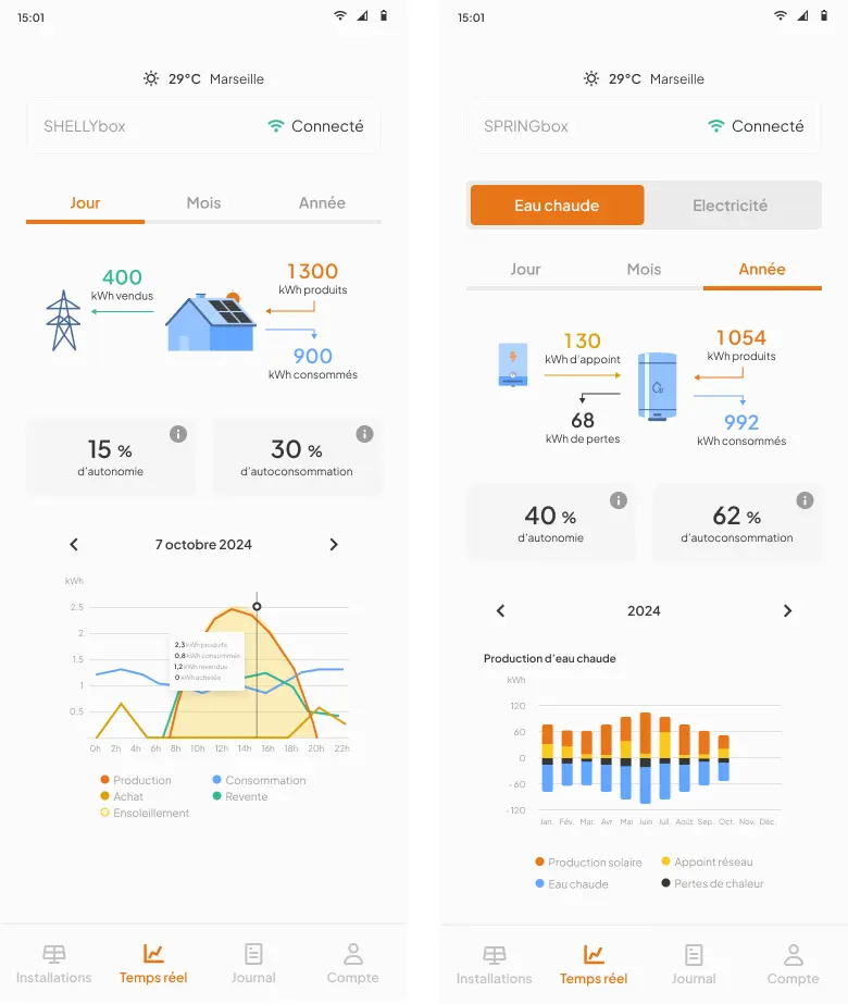
Those two sources led me to conclude it was a clarity and trust problem rather than an isolated bug. I merged the exposure step into the roof step, with the same satellite reference and a single decision to make, bringing the journey from 6 to 5 steps: four simulation steps, then sign-up. I also streamlined the IoT app setup so customers and installers could succeed on their own.
The success criterion: conversion, meaning prospects who reach the end of the journey and click “Sign up” at the end of the simulation (sign-up is required to see the results), a sign they trust the tool enough to move toward purchase on their own. I also tracked total time and time per page, to check that the simplification was reassuring. A/B (MAB) test result: at least +14% clicks on “Sign up”, and a shorter journey time, which I read as a sign of reassurance.
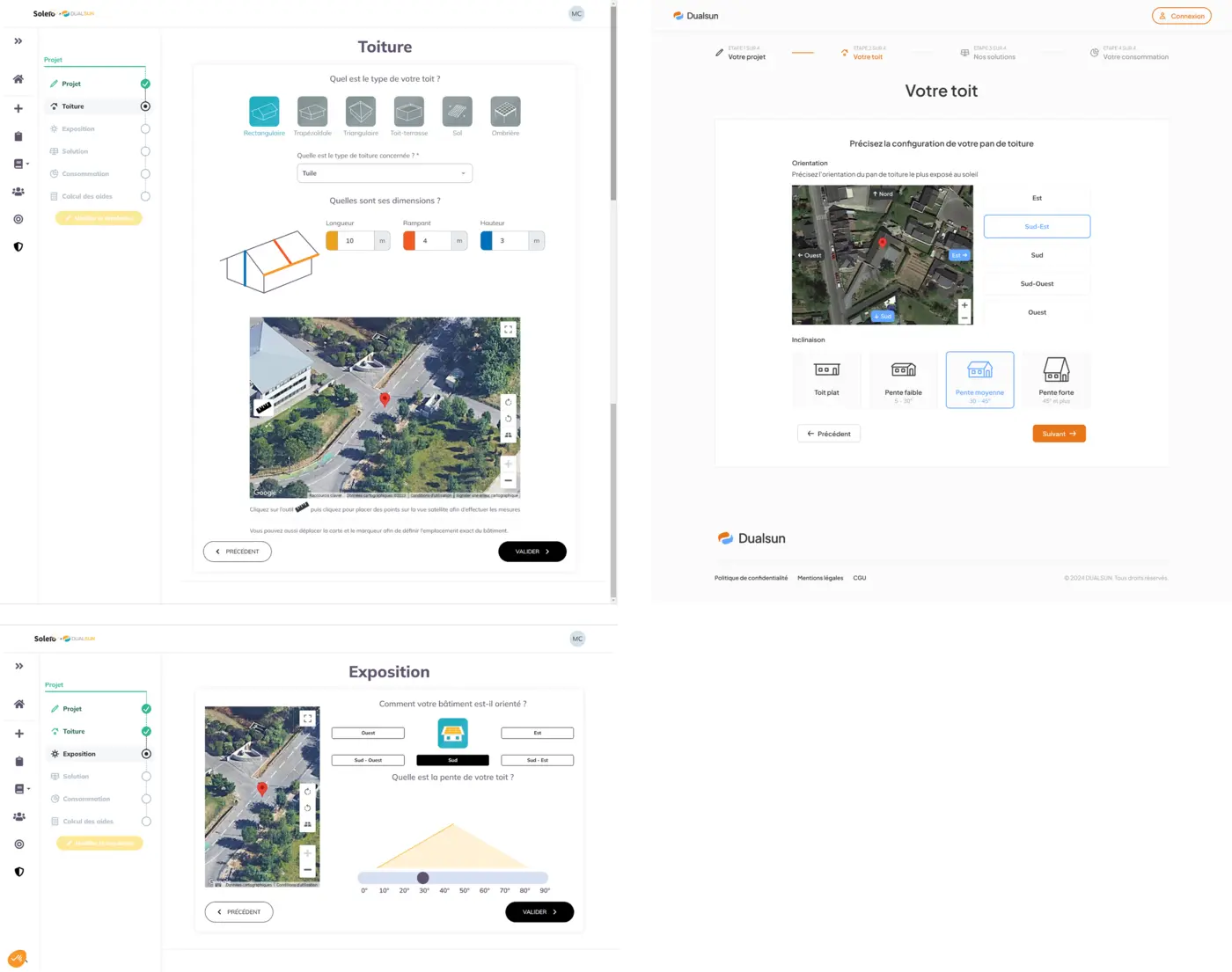
Left: the old two-step journey (Roof, then Exposure). Right: the new merged 'Your roof' step that replaces both — +14% clicks on “Sign up” at the end of the simulation, validated by A/B (MAB) testing. Unblock research
Get design out of the bottleneck
“Testing with one user early in the project is better than testing with 50 near the end.”
— Steve KrugTesting early, with a few people, beats waiting until the end and leaning on metrics alone: that's the principle that guided this shift at Dualsun — testing more often, with more people, from the earliest sketches and prototypes, while keeping data and KPIs as a safety net toward the end.
The real challenge wasn't just UX: design had become a mandatory checkpoint for the whole team, and the best answer was to multiply our capacity to design and test.
I set up a pool of beta testers (partner installers and satisfied B2C customers): a Brevo email to every new customer and all partner installers invites them to join; on click, their acceptance and its date are recorded in Odoo, our ERP, and the date of their last interview is entered by hand. Testers can then be contacted more often, without mass mailings, hunting for the best profiles or asking CSMs who to reach out to. I also trained PMs on UX interviews so we could run interviews in parallel instead of queuing them through me. I built ready-to-use low-fi templates so anyone could illustrate their ideas without waiting for a slot with me.
And I trained — a few hours were enough — PMs, Marketing, product engineers and developers on Figma: developers could explore the design system, export mockup code and inspect dimensions themselves; PMs could edit a screen, build a flow or a quick prototype without me; Marketing could update icons, colors and illustrations for branding; and product engineers could organize their own diagrams, with colors pulled straight from the design system — faster and more consistent than a shared Adobe license, with its color inconsistencies and frequent crashes. The goal: level up the whole product team so design stopped being the bottleneck and everyone got more autonomy.
Direct freelancers
Two freelancers folded into the design system
On the most UI-heavy screens, I brought in a freelance UX/UI designer and a graphic designer for short stints.
With the graphic designer, I briefed the work and gave feedback on the direction of illustrations and tutorial videos (for example, for the IoT box wiring guide), with reference Figma screens to keep things consistent with the design system.
With the UX/UI designer, the real work was growing her ability to argue for her choices: she produced a lot of screens but rarely justified her decisions. I challenged her systematically ('why this pattern? what's the convention here, why deviate? what's your recommended flow, and why?'), she reworked her screens with my feedback, and our follow-up discussions got sharper on both sides. I then integrated and adapted those screens into the product following the same patterns as the rest of the design system — so we could parallelize delivery while keeping visual and functional consistency across every platform.
One of the animated wiring tutorials made by the freelance graphic designer, based on my brief and feedback. 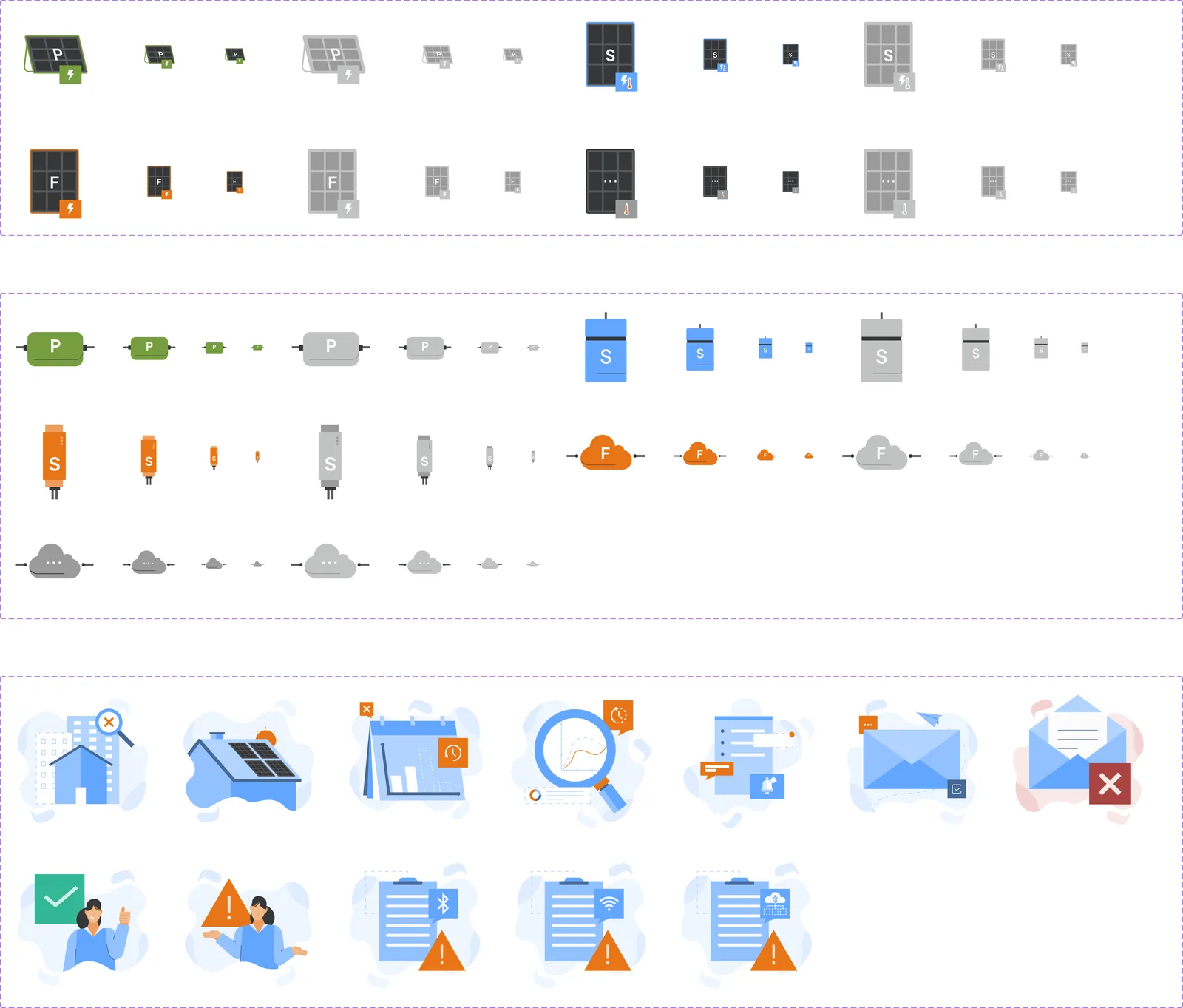
Static illustrations (empty states, IoT boxes, panels) produced by the freelance graphic designer from my brief. 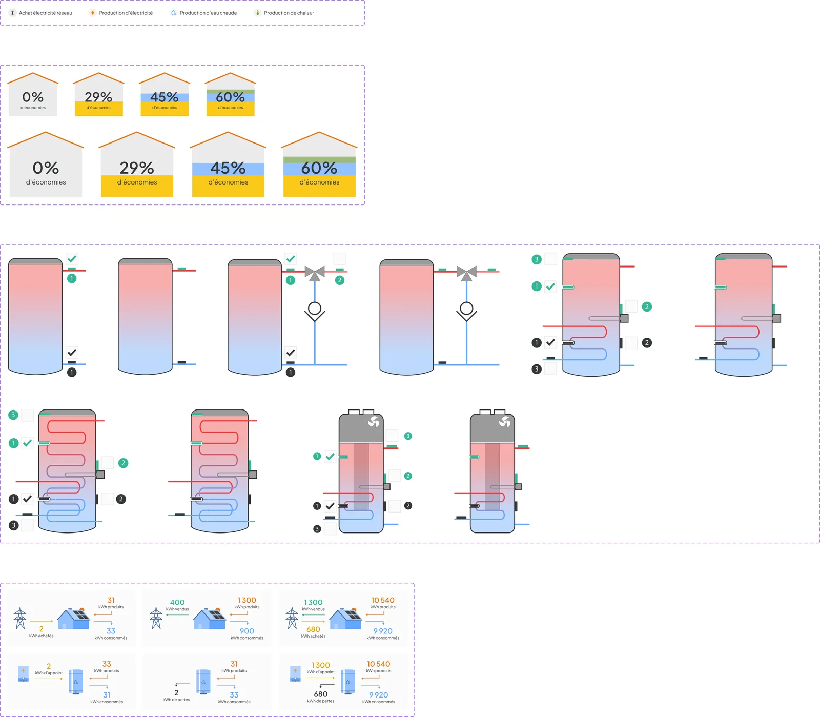
My own technical illustrations, adapting the graphic designer's style and older product diagrams. 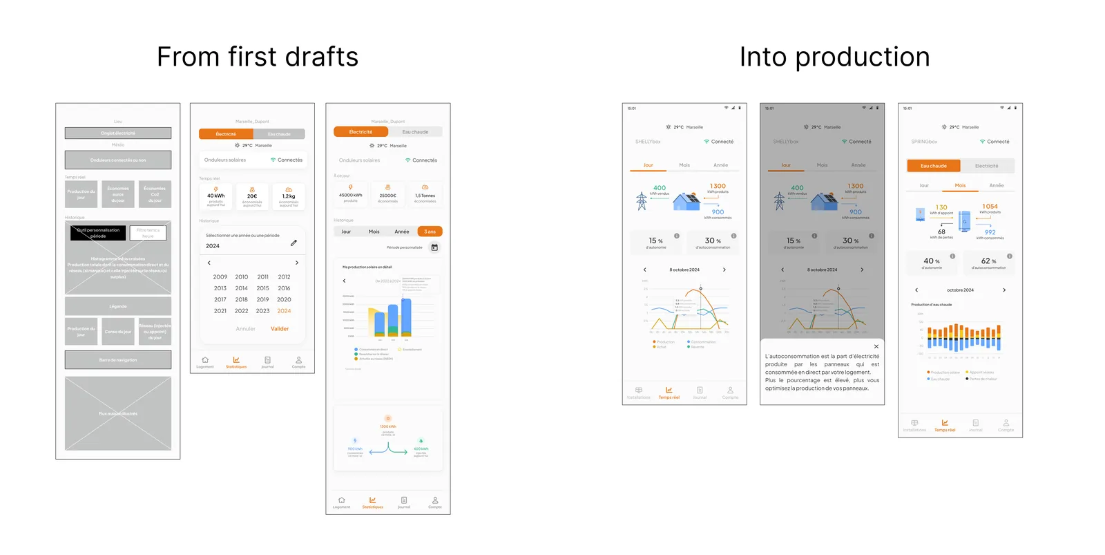
From the freelance UX/UI designer's first draft to version 5, through to my final touch-ups shipped to production. A tone of voice built per user persona
Content and the visual refresh, side by side
Alongside the visual system, I wrote the product's tone-of-voice rules with distinct guidance per audience: professional installers need direct, jargon-light instructions; homeowners need reassurance and plain language. Each rule ships with a right/wrong example, so the whole team applies it consistently.
This period also overlapped with a rebrand of the graphic charter. I got involved upstream to bring my accessibility expertise — arguing for certain color choices to guarantee contrast, and staying attentive to the readability of the typography and logo. The changes were then replicated and tokenized in the design system, to stay consistent, roll out quickly, and keep a code export that's easy to maintain.
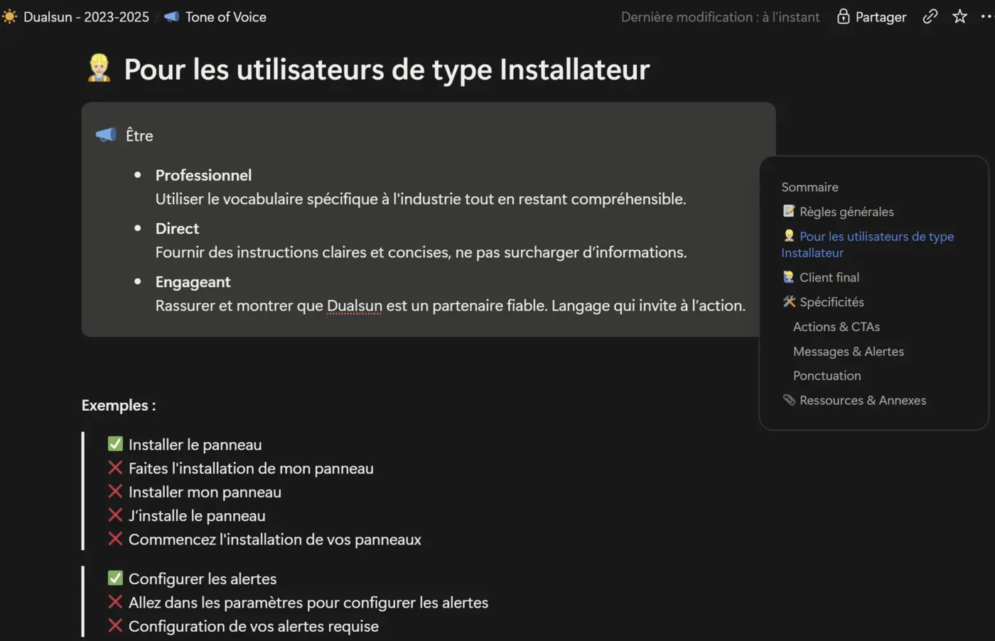
Tone-of-voice rules written for the 'Installer' persona, with right/wrong copy examples so the whole team applies them consistently. Lead & enable
Plan the roadmap, ship a guided, responsive journey
I took part in product planning and strategy with the PM and POs. For each product (the mobile app, the intranet for installers to manage solar projects), we reviewed the features to build, prioritized them and set deadlines accounting for design, development and review. The priorities: the mobile app (onboarding and guidance for hook-up, new IoT equipment for a new type of panel, B2B and B2C simplification to reduce setup and day-to-day friction) and the MyDualsun simulator, to bring in more prospects, hence more revenue and partnerships with satisfied installers to whom we send customers.
It's with Laura White, PM, that I learned to build a roadmap and a benchmarking strategy: she supported me, gave me a voice and real weight in building the roadmap, the planning and the prioritization, and I supported her in return on writing dev tickets.
Two trade-offs in this roadmap: the roof-step redesign wasn't a priority at first; by analyzing the data and the potential gains, then justifying them to the PM, we reprioritized it with the PO. And I prioritized building the beta-tester pool, so we could test more often and more efficiently (see step 02).
I scaled a WCAG design system (Tailwind, Material/Ionic) — with the same clarity and logic on mobile as on the desktop simulator, with sign-up asked only at the end of the simulation, to access the results.
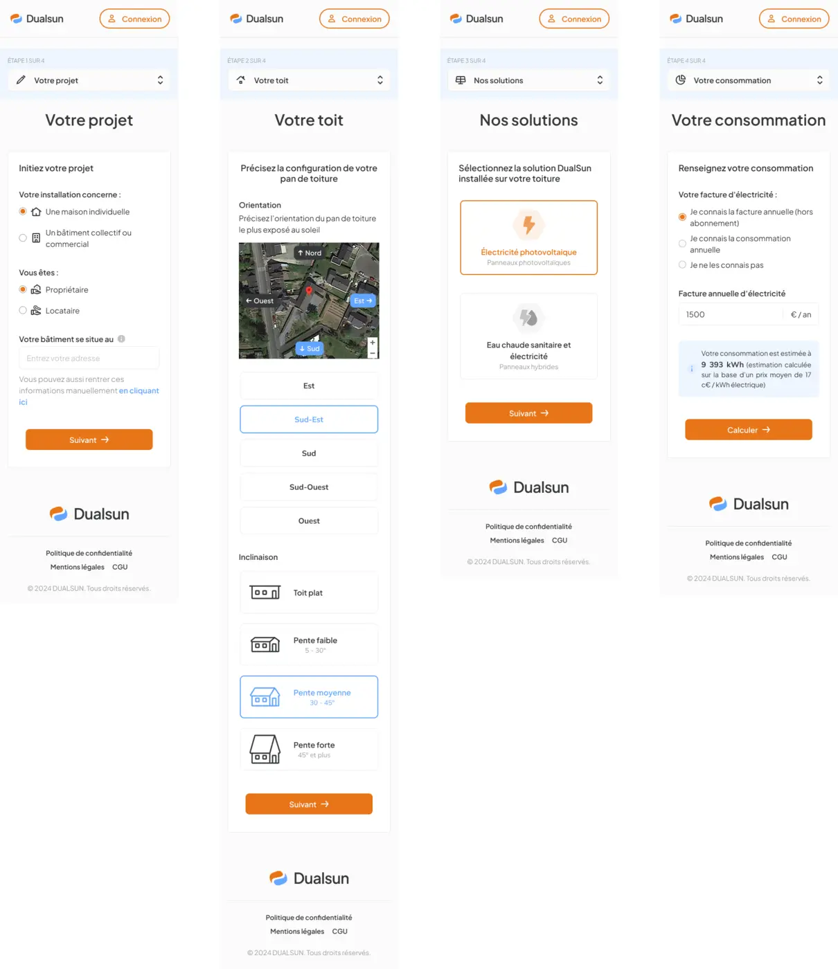
The four-step journey for prospects (no account) — project, roof, solutions, consumption — shown here on mobile, end to end.
Results
- Journey simplified from 6 to 5 steps (four simulation steps, then sign-up) by merging roof and exposure, validated by A/B (MAB) testing → +14% clicks on “Sign up” at the end of the simulation
- WCAG design system shipped and unified across three platforms (Tailwind, Material/Ionic)
- Tone of voice written per user persona (professional installer vs. homeowner), with right/wrong copy examples so the whole team applies it consistently
- Beta-tester pool set up and PMs trained on UX interviews to parallelize research, ready-to-use low-fi templates, and Figma taught to PMs, Marketing, product engineers and developers for more autonomy
- Product planning with the PM and POs: prioritization and deadlines per product, and the roof-step redesign reprioritized based on an analysis of expected gains
- Two freelance designers directed to parallelize delivery
- Coached a freelance UX/UI designer toward stronger product reasoning (pattern choices, conventions), beyond pure UI execution